Decoding the Crypto Market’s Secret Language
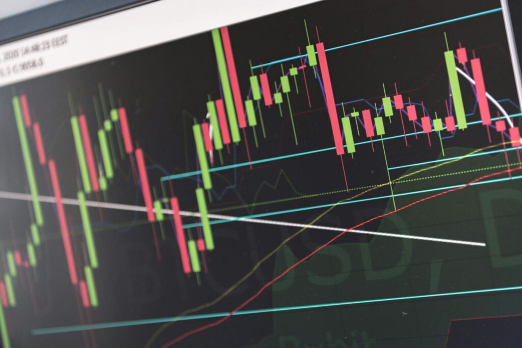
Ever stared at a crypto chart and felt like you were trying to read an alien language? All those red and green bars, wicks sticking out everywhere… it can feel overwhelming. But what if I told you those little shapes are telling a story? A story of greed, fear, and the epic battle between buyers and sellers. Mastering candlestick patterns is like learning that language. It’s not about predicting the future with 100% certainty (let’s be real, nothing does that), but it’s about stacking the odds in your favor. It’s about spotting clues that signal when a trend might reverse, continue, or simply pause. This guide isn’t just a dictionary of patterns; it’s a deep dive into the psychology behind them, so you can stop guessing and start making data-driven decisions for your crypto entry and exit points. Ready to learn the language of the market?
Key Takeaways:
- Candlestick patterns are visual representations of price movements, showing the open, high, low, and close prices for a specific period.
- They reveal the psychology of the market, illustrating the struggle between buyers (bulls) and sellers (bears).
- Bullish patterns like the Hammer and Bullish Engulfing can signal potential upward price movements and ideal entry points.
- Bearish patterns such as the Shooting Star and Bearish Engulfing warn of potential downturns, suggesting good exit points.
- Confirmation is crucial. Never trade a pattern in isolation. Always look for other confirming signals like volume, trend lines, and other technical indicators.
First Things First: What Exactly Am I Looking At?
Before we jump into the fancy patterns, let’s get the absolute basics down. Think of each candlestick as a snapshot of a trading period—whether it’s one minute, one hour, or one day. It packs a ton of information into one simple shape.
Here’s the anatomy:
- The Body: This is the thick, rectangular part. It tells you the difference between the opening price and the closing price. If the body is green (or white), the close was higher than the open. The bulls won that round. If it’s red (or black), the close was lower than the open. A victory for the bears.
- The Wicks (or Shadows): These are the thin lines sticking out of the top and bottom of the body. They represent the highest and lowest prices the asset hit during that period. A long upper wick means buyers tried to push the price way up, but sellers smacked it back down. A long lower wick means sellers tried to tank the price, but buyers swooped in and pushed it back up.
That’s it. Seriously. The color of the body tells you who won the session, and the wicks tell you about the battles that were fought along the way. Now, let’s see what happens when you put a few of these candles together.

Bullish Reversal Patterns: Spotting the Bottom
These are the patterns that get traders excited. They often appear at the end of a downtrend and can signal that the momentum is about to shift from selling to buying. Spotting one of these can give you a great potential entry point before the crowd jumps in.
The Hammer: A Sign of Rejection
Imagine a market that’s been falling. Sellers are in full control, pushing the price down, down, down. Then, within a single candle, the price plummets but then—BAM!—buyers step in with massive force, pushing the price all the way back up to close near where it opened. That’s a Hammer.
It looks like its namesake: a small body at the top with a long lower wick that’s at least twice the size of the body. The color of the body doesn’t matter as much, but a green hammer is slightly more bullish. What’s the story here? The market rejected lower prices. Sellers tried to continue the downtrend, but they failed. This exhaustion of selling pressure is a powerful signal that the bulls are waking up.
The Bullish Engulfing Pattern: A Total Takeover
This is one of the most powerful candlestick patterns out there. It’s a two-candle pattern. You’re in a downtrend, and you see a small red candle. The sellers are still in control, but maybe they’re getting a bit tired. The very next candle is a massive green one that completely ‘engulfs’ the previous red candle’s body. Its opening price is lower than the previous close, and its closing price is higher than the previous open.
Think about the psychology. The day (or hour) started with sellers trying to push the price down even further, but then an overwhelming wave of buying pressure came in and not only erased the sellers’ progress but also pushed the price significantly higher. It’s a complete sentiment shift. It’s a hostile takeover by the bulls, and it’s a very strong sign that the downtrend might be over.
The Morning Star: A Glimmer of Hope
The Morning Star is a three-candle pattern that signals hope after a period of darkness (a downtrend). It unfolds like this:
- First Candle: A long, scary red candle. The downtrend is still in full effect.
- Second Candle: A small-bodied candle (it can be red or green, or even a Doji) that gaps down from the first one. This is the key. It shows that the selling pressure is fizzling out. There’s indecision in the market.
- Third Candle: A strong green candle that closes well into the body of the first red candle. This confirms that the buyers have taken control.
The Morning Star shows a gradual but decisive shift from bearish to bullish control. The sellers were in charge, they hesitated, and then the buyers seized the opportunity.
Bearish Reversal Patterns: Knowing When to Exit
Just as important as knowing when to buy is knowing when to sell. Bearish patterns appear at the top of an uptrend and warn that the bulls might be running out of steam. Recognizing these can help you lock in profits before a potential crash.
The Shooting Star: A Failed Launch
The Shooting Star is the evil twin of the Hammer. It occurs at the top of an uptrend. The price opens, buyers push it way, way up, creating a new high. Everything looks great! But then, the sellers step in and hammer the price all the way back down, causing it to close near its opening price. The result is a small body at the bottom with a long upper wick.
The story? The bulls tried to continue their epic rally, but they hit a wall of sellers. This strong rejection of higher prices is a huge red flag. It shows that the buying momentum is gone and the bears are starting to test the waters. It’s a sign that the party might be over.
The Bearish Engulfing Pattern: Bulls Get Swallowed
You guessed it—this is the opposite of the Bullish Engulfing pattern. After a nice uptrend, you see a green candle. The next candle is a huge red one that completely engulfs the body of the previous green candle. It opens higher than the previous close but then closes lower than the previous open.
This is a brutal reversal. The market tried to continue its upward journey, but sellers stepped in with such force that they completely wiped out the previous session’s gains and then some. It’s a very clear and powerful signal that sentiment has shifted, and a downtrend may be imminent. If you’re in a long position, seeing this pattern should make you very, very nervous.
The Evening Star: Dusk is Falling on the Rally
The Evening Star is the bearish counterpart to the Morning Star. It’s a three-candle pattern at the top of an uptrend:
- First Candle: A long, healthy green candle. The uptrend is strong.
- Second Candle: A small-bodied candle (or Doji) that gaps up. This shows the bulls are hesitating. The conviction is fading.
- Third Candle: A big red candle that closes deep into the body of the first green candle. This confirms the bears have taken over.
Just like the Morning Star, it shows a transition of power. The bulls were confident, they faltered, and the bears capitalized on their weakness.
Patterns of Indecision: When the Market Pauses
Not every pattern screams “BUY!” or “SELL!”. Some just whisper, “Hey, we’re not sure what to do next.” These indecision patterns are just as important because they signal a potential change is coming. They are the market taking a breath before the next big move.
The Doji: A Perfect Stalemate
A Doji is a fascinating candle. It happens when the opening and closing prices are virtually the same. The result is a candle with no real body—just a horizontal line with wicks. It looks like a cross or a plus sign.
A Doji signifies a perfect equilibrium between buyers and sellers. Neither side could gain control. By itself, it doesn’t mean much. But its location is everything. A Doji after a long uptrend? It could mean the buyers are exhausted. A Doji after a long downtrend? It could mean sellers are running out of ammo. It’s a sign of potential reversal, a moment of pure indecision that you must pay attention to.
Spinning Tops: A Fierce but Undecided Battle
A Spinning Top is similar to a Doji, but it has a small body. It also has long upper and lower wicks. This candle tells a story of a wild trading session where both bulls and bears made significant pushes, but ultimately, neither side won. The price ended up closing very close to where it opened.
Like the Doji, a Spinning Top indicates market indecision. The existing trend could be losing its momentum, and a change could be on the horizon. When you see a series of Spinning Tops, it’s a clear sign the market is coiling up for its next move.

The Golden Rule: Context and Confirmation Are Everything
Okay, you’ve learned a few patterns. You’re ready to start trading, right? Hold on. This is the part that separates amateur traders from profitable ones. A candlestick pattern in isolation is meaningless. It’s just a shape. To make it a high-probability trading signal, you need two things: context and confirmation.
Never, ever trade a pattern just because you see it. Think of it as a clue in a larger detective story, not the final answer. Ask yourself: Where is this pattern occurring? What is the overall market trend? What is the volume telling me?
Context: Where is the Pattern?
A Hammer pattern is a bullish reversal signal, but it’s only powerful if it appears at the bottom of a clear downtrend, ideally at a known support level. A Hammer appearing in the middle of a choppy, sideways market doesn’t carry the same weight. Similarly, a Shooting Star is only a strong bearish signal if it forms at the top of a strong uptrend, especially near a resistance level.
Confirmation: What Happens Next?
Don’t jump into a trade the second a pattern completes. Wait for confirmation. If you see a Bullish Engulfing pattern, the confirmation would be the next candle also closing green, or the price breaking above the high of the engulfing candle. If you see a Bearish Engulfing, wait for the next candle to be red and for the price to break below the low of the pattern. This patience can save you from countless ‘false signals’ or ‘fakeouts’.
The Volume Factor
Volume is your truth detector. A powerful reversal pattern should ideally be accompanied by a surge in volume. For a Bullish Engulfing pattern, seeing high volume on that big green candle adds a massive amount of conviction. It shows that a lot of traders were participating in that bullish takeover. Low volume on a breakout or reversal pattern is a red flag—it suggests a lack of conviction, and the move is more likely to fail.
Conclusion
Learning to read candlestick patterns is an essential skill for any serious crypto trader. It’s not a magic bullet, but it’s a powerful tool that gives you an edge by helping you understand market psychology and identify high-probability entry and exit points. Start by learning to identify the key patterns we’ve discussed. Open up a chart and look for them in historical data. See how they played out. Remember the golden rule: always look for context and confirmation. By combining candlestick analysis with other tools like trend lines, support/resistance, and volume, you’ll move from being a reactive trader to a proactive one who can read the story the market is telling.
FAQ
What is the most reliable candlestick pattern?
While no pattern is 100% reliable, many traders consider the Engulfing patterns (both Bullish and Bearish) to be among the strongest signals. This is because they represent a very decisive and powerful shift in market sentiment within a short period. However, their reliability increases significantly when they appear at key support or resistance levels and are confirmed by high volume.
Can I use candlestick patterns on any time frame?
Yes, candlestick patterns are fractal, meaning they can be applied to any time frame, from 1-minute charts for scalping to daily or weekly charts for long-term investing. The underlying psychology they represent is the same. However, patterns on higher time frames (like daily or weekly) are generally considered more significant and reliable than those on very short time frames, which can have more ‘noise’.
Do I need other indicators besides candlestick patterns?
Absolutely. Relying solely on candlestick patterns is a recipe for disaster. They are most powerful when used as part of a comprehensive trading strategy. You should always use them in conjunction with other forms of analysis, such as identifying the overall market trend, locating key support and resistance levels, and using indicators like the Relative Strength Index (RSI) to gauge momentum or Moving Averages to confirm trend direction.
